
Product Design for Education
Foundry College
This page walks through three projects for Foundry College, an ed-tech startup building a virtual platform to advance adults' professional skills. We were doing this pre-pandemic, before Zoom made remote learning the default, which meant designing for a kind of trust and engagement the market hadn't caught up to yet. Foundry closed in 2022; the work here reflects the design system I built as product designer. During my time there, I:
co-led the redesign of platform lesson editor
led architecture and design for a student data dashboard, incorporating learnings from instructor interviews and student feedback
built a visual system for a virtual education platform
oversaw daily QA meetings and managed interns
demonstrated the webapp product to prospective partners, playing a key front-facing role in business development efforts
Lesson Builder
Tool Re-design
Overview. Companion to the teaching platform, this tool integrated existing slide decks with engaging in-class activities and breakouts. Instructors and Instructional Designers used it to pre-set a lesson, which notably reduced the cognitive load on the instructor when managing multiple activities during a live, remote class.
My Role. Co-led UX design, led visual design and component specifications.
Audience. Instructional Designers, Course Assistants, Instructors
Problem. The system needed a high level of internal knowledge to operate. The flow of the app made it difficult to scan for errors and slowed the review process.
Process.
Conducted an audit of the existing editor
Interviewed instructors and course designers on pain points
Created ideal workflows page-by-page
Updated the look with a focus on heuristics and brand alignment. This project also kicked off the creation of new UI components for the company design system.
Outcome. Reduced errors and lessened amount of knowledge needed to operate—instructors who were not comfortable with the platform were more likely to make their edits prior to class.

Audit of Original Editor
(Click Image to Expand)
Notable Re-designed Features
(Click Image to Expand)


UI Component

Course Cards for Reporting Dashboard
Task. Re-design course cards for the reporting dashboard.
My Role. I was the lead visual designer for this component. I reviewed ideas and critiques with my team (3 engineers, 2 designers) and incorporated feedback.
Brand Identity. Professional and modern program to upskill working adults. Colors include dark blue, light blue, and orange accent.
Audience. Administrators, Instructors, and Internal Personnel.
Purpose. Show top-level data for a course and act as a button to drill down into further details.
Original Card, Critiques,
and Explorations
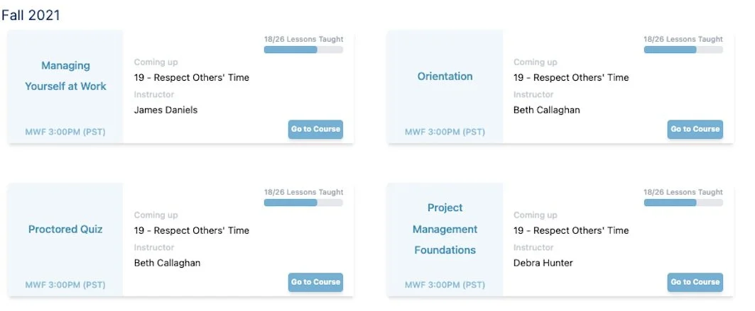
The original card design incorporated necessary information, but could be improved in hierarchy, accessibility, brand alignment, and discovery.
The course title should be the highest in the visual hierarchy. The medium-weight black text stands out more than the title, even though it is tertiary information
Though the light blue color is one of the brand colors, it is meant to be an accent. The color on its own does not pass accessibility tests
Though a go-to-course button does look like a button, tests with administrators suggested that they try to click on the course title and prefer a larger target
All cards had the same style, which made it difficult to scan for the correct course
Explorations
To improve the hierarchy, I worked to add variety to the cards, adjusted the title contrast, and made the entire card the clickable target. Course title was easier to discover, however instructors were interested in more at-a-glance data. Cards also needed to identify the trimester to ease with transition between sessions.

Breakdown of the Final Card

In most cases, the administrators would treat this card as a button to navigate to specific data, making the course title the most important element in the hierarchy. I aimed to push this hierarchy through:
High contrast between the background and white title
Heavier weight, and the largest text on the card
Drop shadow on the text, which acts as a subtle outline to maintain readability on all card colors
Elongated height of the title area, which provides breathing room and enough space for course titles that may span 3 lines

This project led to an extension of the brand palette into additional hues for platform use.
UI Kit
Through various platform updates and projects, I built and maintained the UI component library for engineer use.